Space Cadet Edibles
- Client:
- Space Cadet Edibles (Fictional)
- Type of Project:
- Branding ● Packaging ● 3D
- Team Size:
- 1
- Date:
- January 2020 - Present
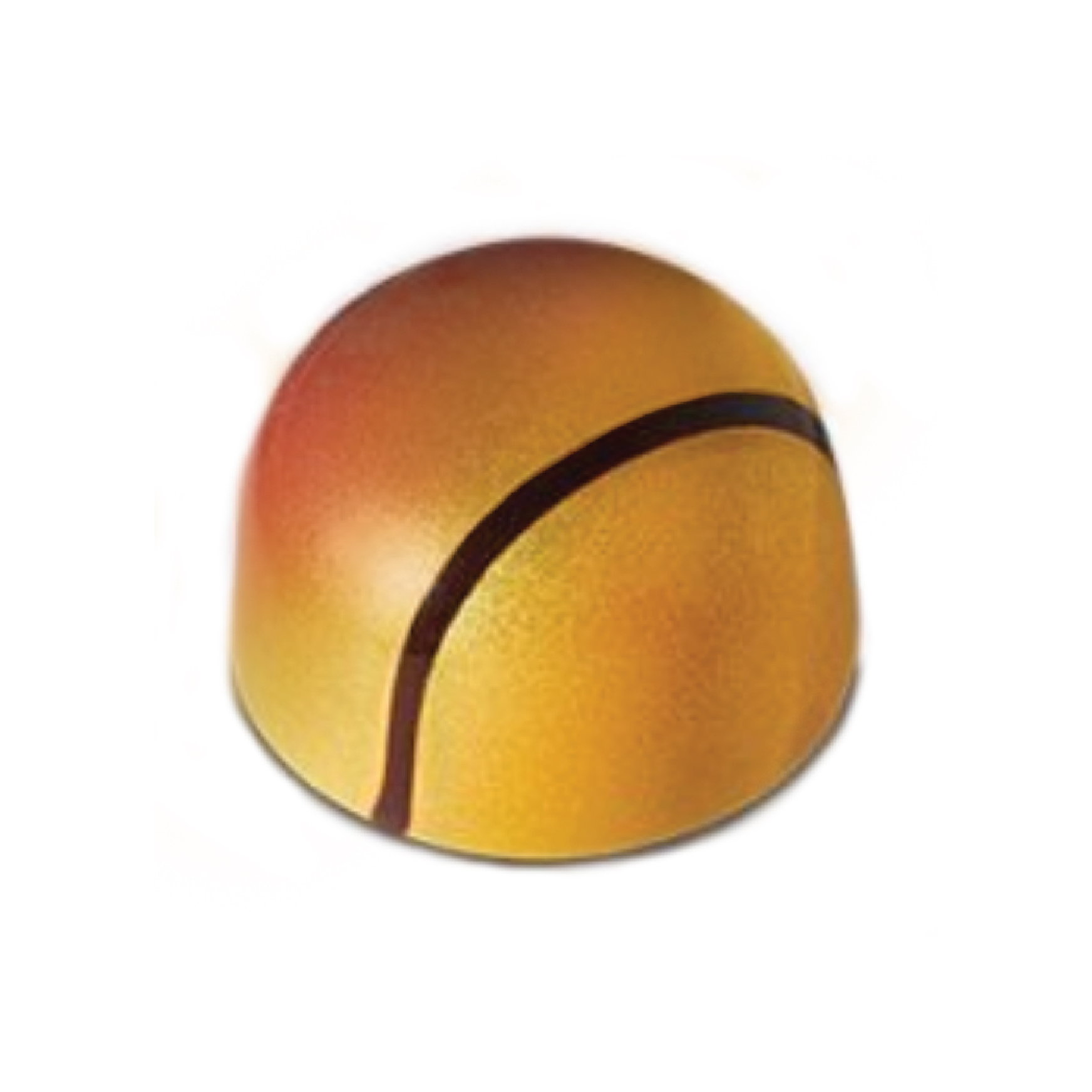
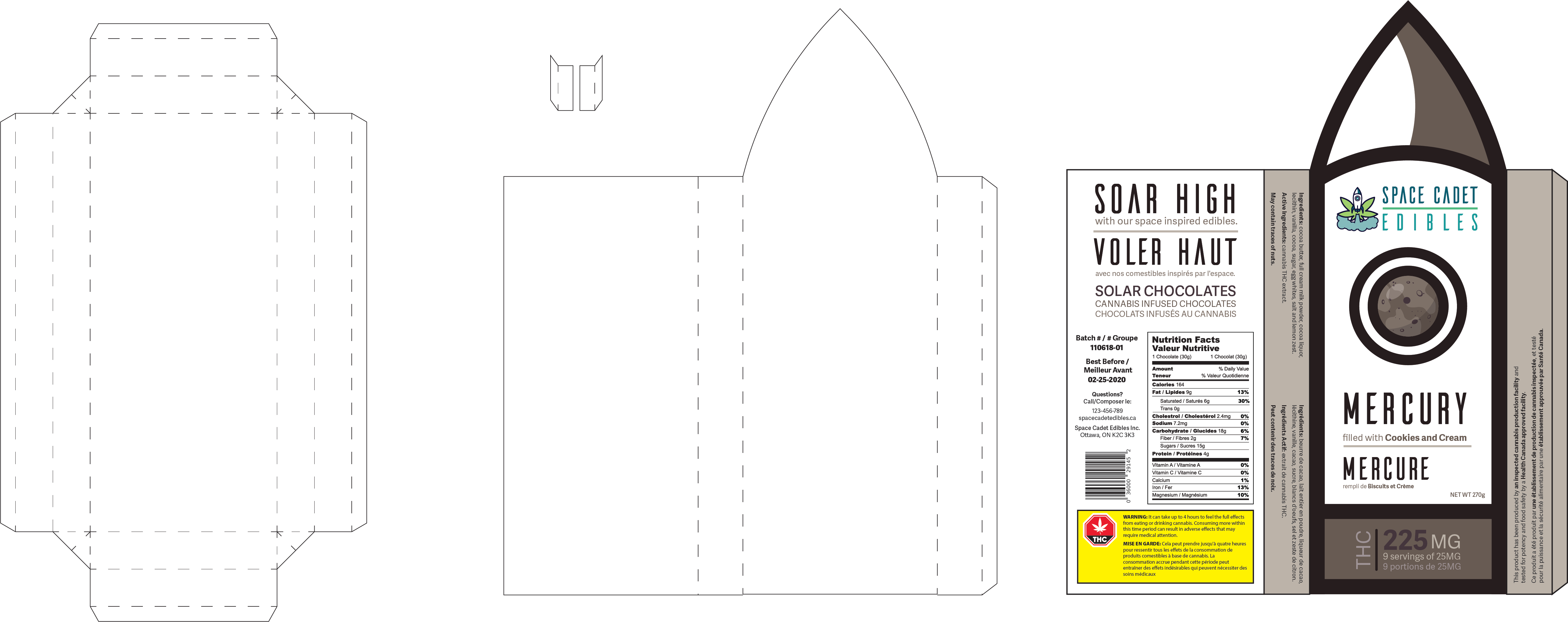
For this project I was tasked with inventing a fictional food company. I then had to come up with a product line and design it's packaging. The product line I developped are small THC infused chocolates that are inspired by planets within our solar system. The package I started with was for Saturn.

Edibles were recently legalized in Canada on October 17th 2019, opening a whole new market of products. Since it's only been a short duration since then, there are not a lot of options available yet. This means there are not very many competitors. The edible market is estimated at $1.6 billion annually. This is an incredible opportunity to take advantage of since the opening of such a large market is not a common occurence.

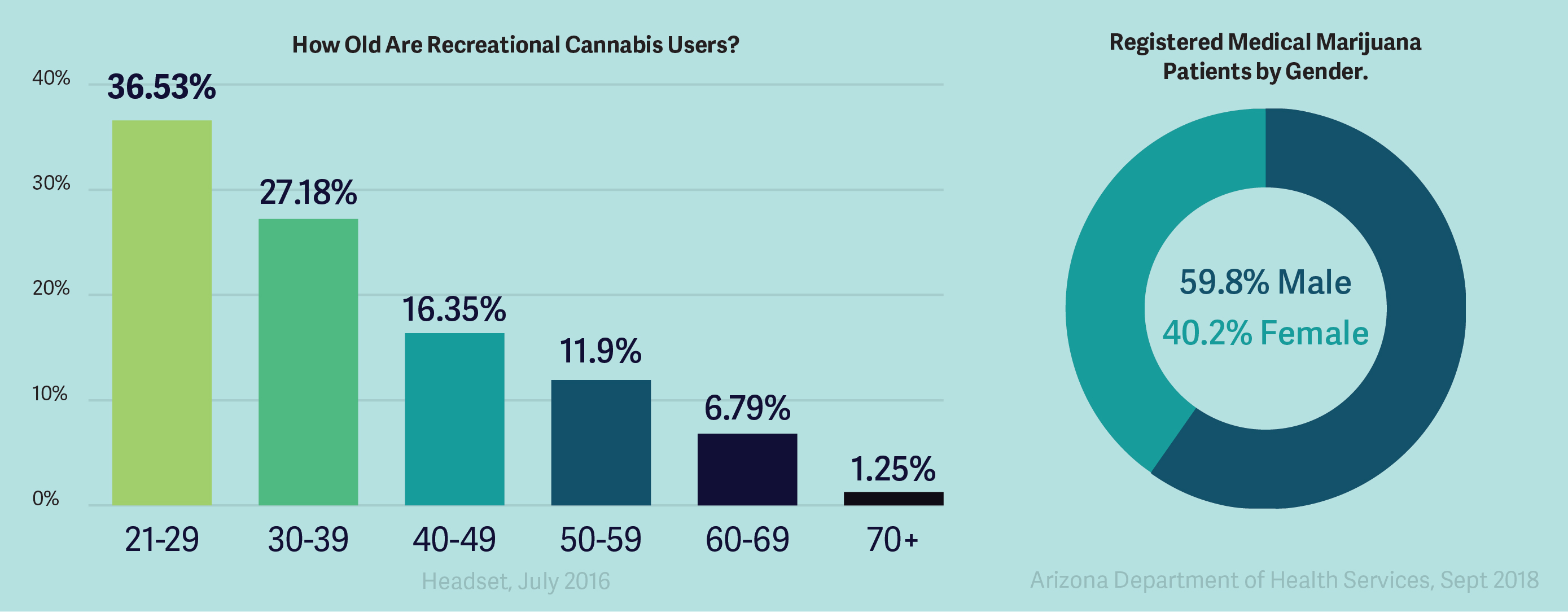
Since Canada has only recently legalized edibles, there aren’t any studies done for what kind of people buy edibles. Due to this, I designed the brand to apeal to the demographic for cannabis. Research shows that more then half of cannabis consumers are between the ages of 21-39 and more then half are male. I wanted the edibles to be a novelty item and not just the regular product. So I wanted the company to have a theme to make it more then just edibles. Taking the demographic into consideration, I decided to make the company space themed to appeal to the male demographic while still keeping the female demographic interested.

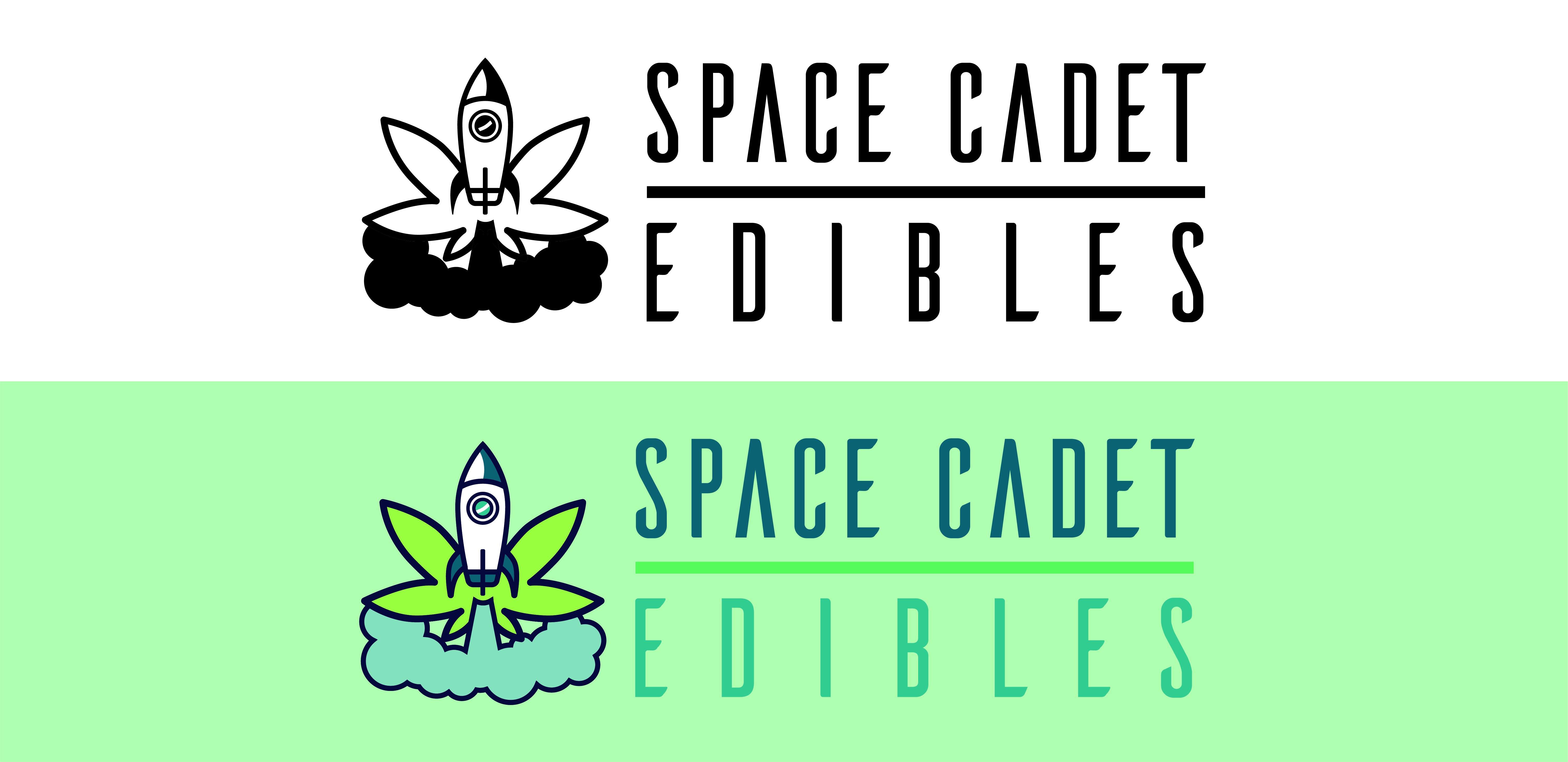
When thinking of ideas for Space Cadet Edibles logo, I was looking at images to inspired me when I came accross a picture of a cannabis leaf. I immediately realized the top portion of the leaf was the same shape as a rocket. I started sketching and coming up with different variations. I knew I wanted it to work in colour and entirely in a single colour, so I sketched them as foreground/background.


I chose these colours because I wanted to stay in the cold colour tones since edibles make people mellow and calm. I also wanted to pick colours that would appeal to both the female and male demographic.

For headers and the wordmark, I chose the font Aileron. I chose this because of how angular and futuristic it looks. For the labels and other text, I chose the font Adelle Sans as Aileron would not be legible in paragraphs.
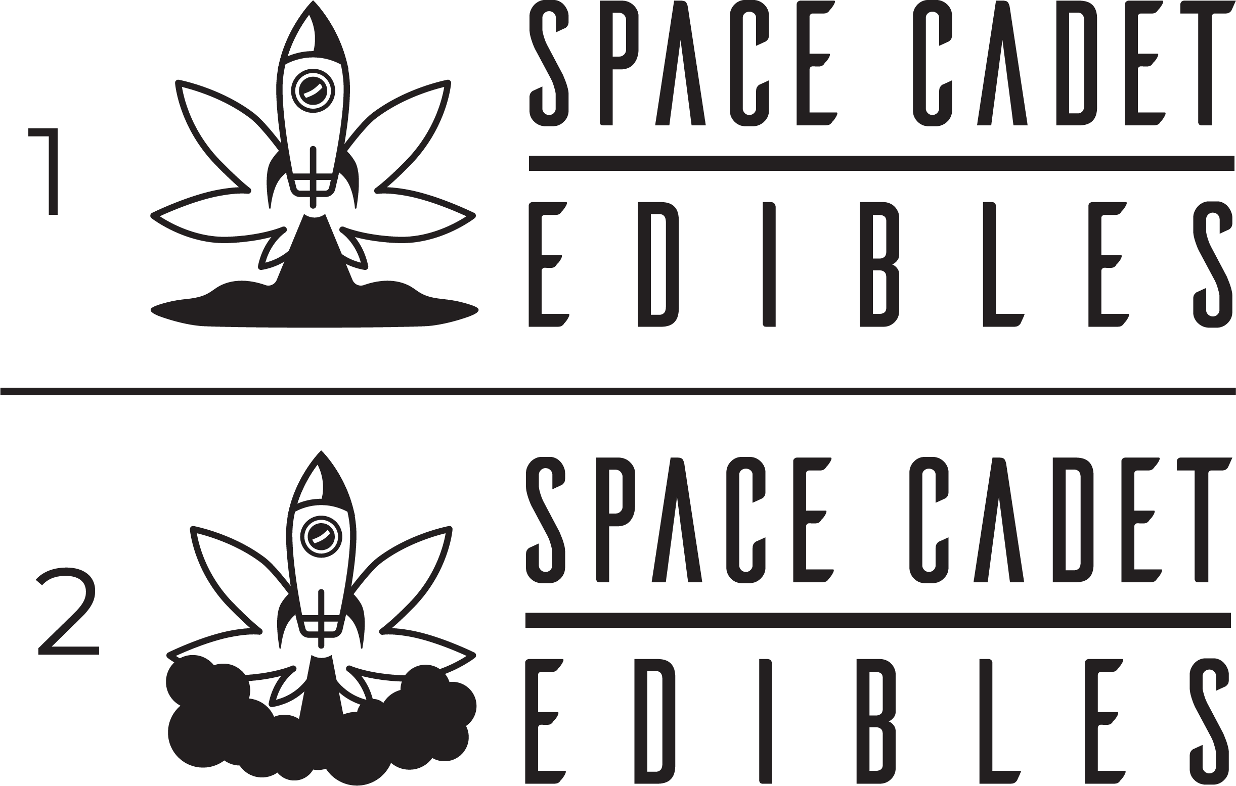
After trying different variations of the logo, I designed a word mark to accompany the logo. In the first stage of logos (1), I found the smoke coming from the rocket to flat. In the second stage of the logo (2), I made the smoke more fluffy and cloud liked. Both version were presented to a group of designers to discuss which would be more effective and the second version was chosen.

After picking the second variation, I did a few changes to make the cannabis leaf stand out more. I thickened the outline on the leaf as well as put it infront of the cloud.
