Three Yellow Dots
- Client:
- City of Ottawa
- Type of Project:
- UI/UX · Symbol Design
- Team Size:
- 5
- Date:
- September 2019 - December 2019

The City of Ottawa noticed that the three dot system was not working and that cyclists were using other methods to cross intersections. They reached out to the Graphic Design students of Algonquin College to help them figure out why this wasn't working and what would be a better solution then the system in place.
Before we could start ideating solutions, we had to learn why there was a problem. Through our research report, we read publications about what symbols other cities and countries were using.
We learned that there was a symbol used widely in other coutries called the R10-22. We went on to explore why this symbol was so successfull in being used and recognized by cyclists. We also ran a survey asking 100 cyclists in the Ottawa what they thought about the current Three Yellow Dots symbol.
The majority of participants answered that they do not believe the symbol is effictive in its intent. Most of them revealed they learned about the symbol through other cyclists and would not have understood it otherwise. Another big thing to consider was that many cyclists were skeptical that the induction loops were even working since there was no feedback given to cyclists to indicate that it was activated. If you would like to read more about what we learned, read the research report in the link below.

Through our research, we learned there was a common theme through things intended for cyclists, the colour green. We knew that incorporating the colour green onto our pavement marking would help cyclists know it's intended for them. Another important thing to consider was the need for a bike somewhere on the symbol. Without using a bike anywhere on the symbol, it's hard to know it's intended for cyclists.

When it was time to design, we did 1 round of sketches and 2 rounds of refinements, working with the client to narrow down our choices. Each member of the team was tasked with coming up with 10 unique pavement markings to indicate to cyclists where they should wait till the green light while at an intersection. To see all sketches produced, click the button below.
All Sketches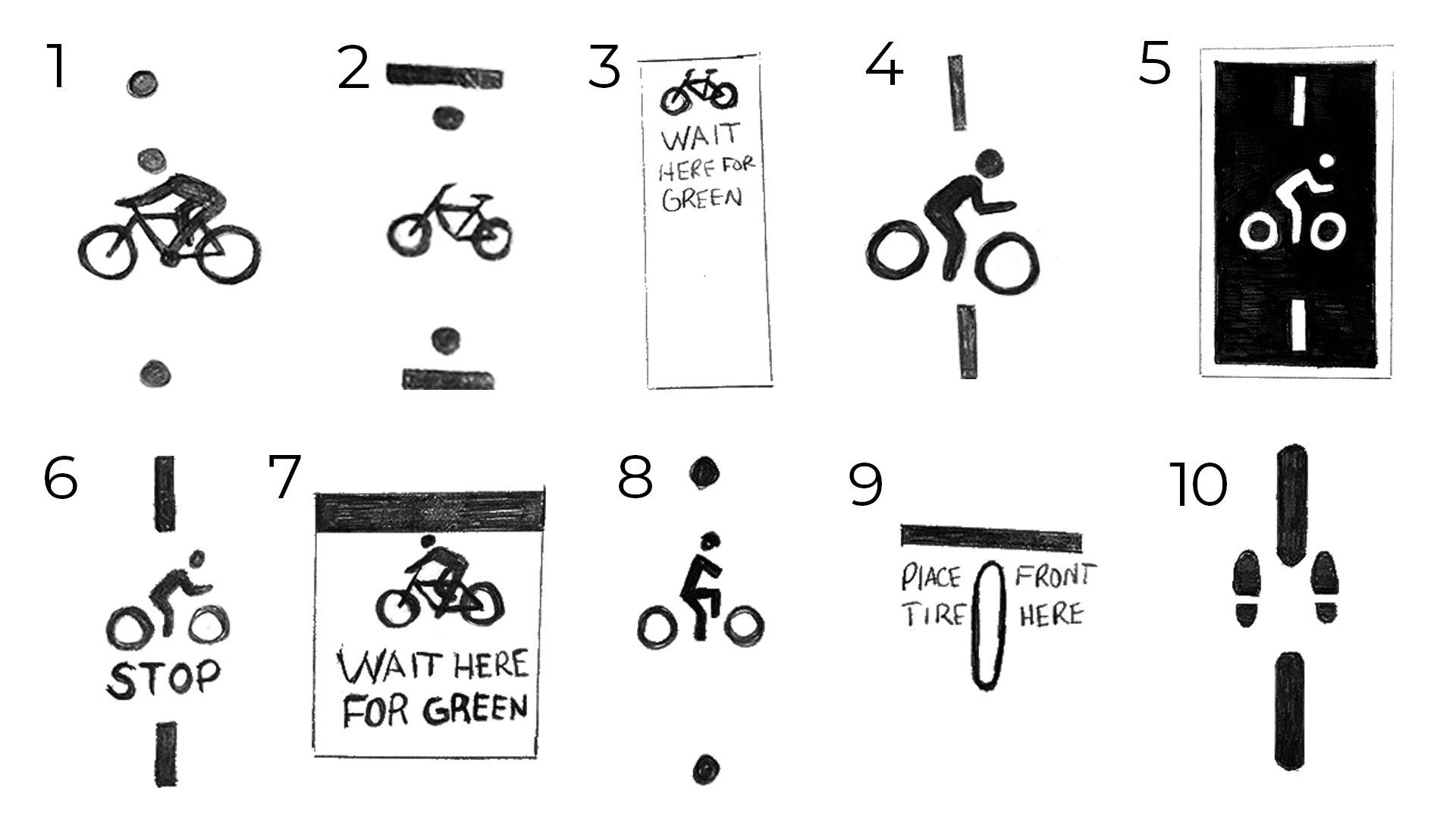
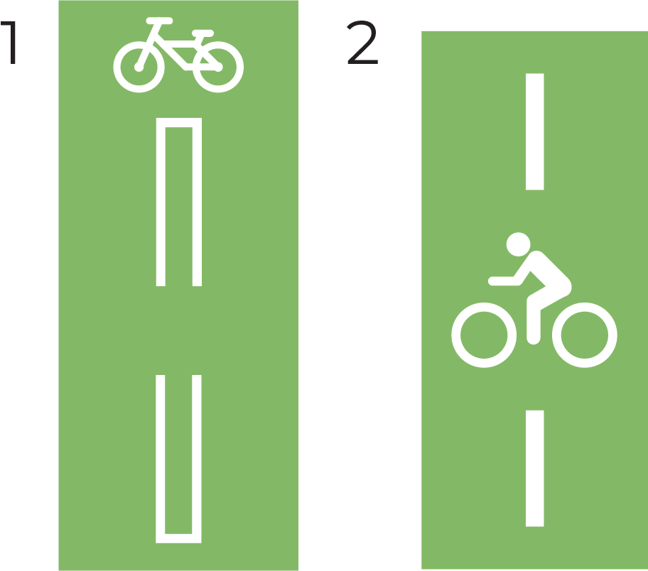
After all 50 pavement marking sketches were shown to the client, we were able to narrow it down to 2 possible solutions.
The clients liked the first concept on the left mainly because of the brackets. The brackets easily communicated to cyclists where they should wait.
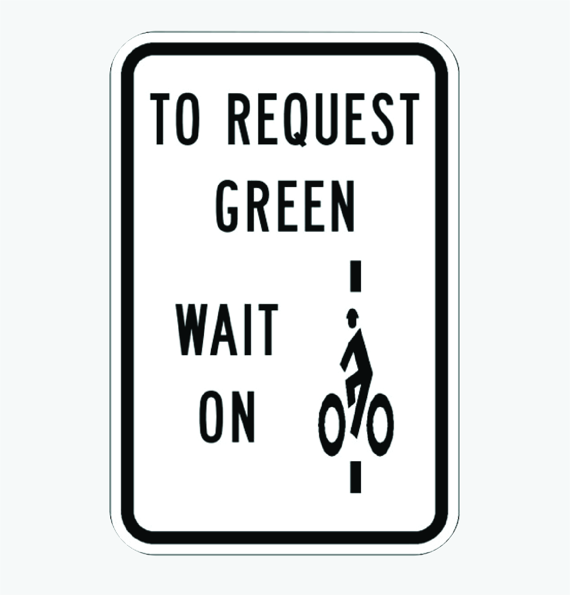
They liked the second concect for similar reasons. The added advantage to the second concept was that it is very similar to the R10-22 sign that is used in other countries and had mesurable success.
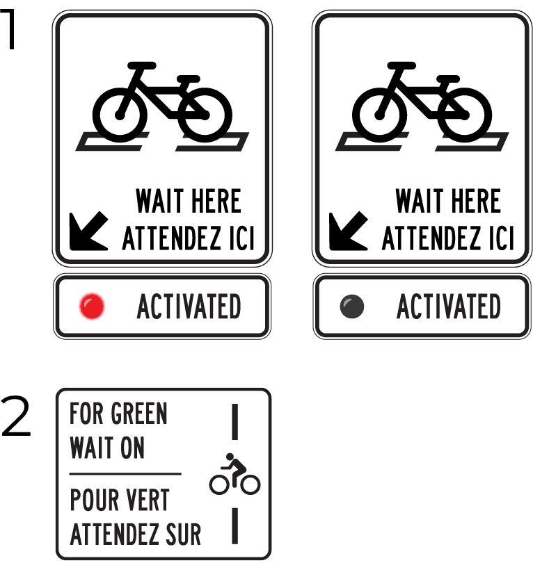
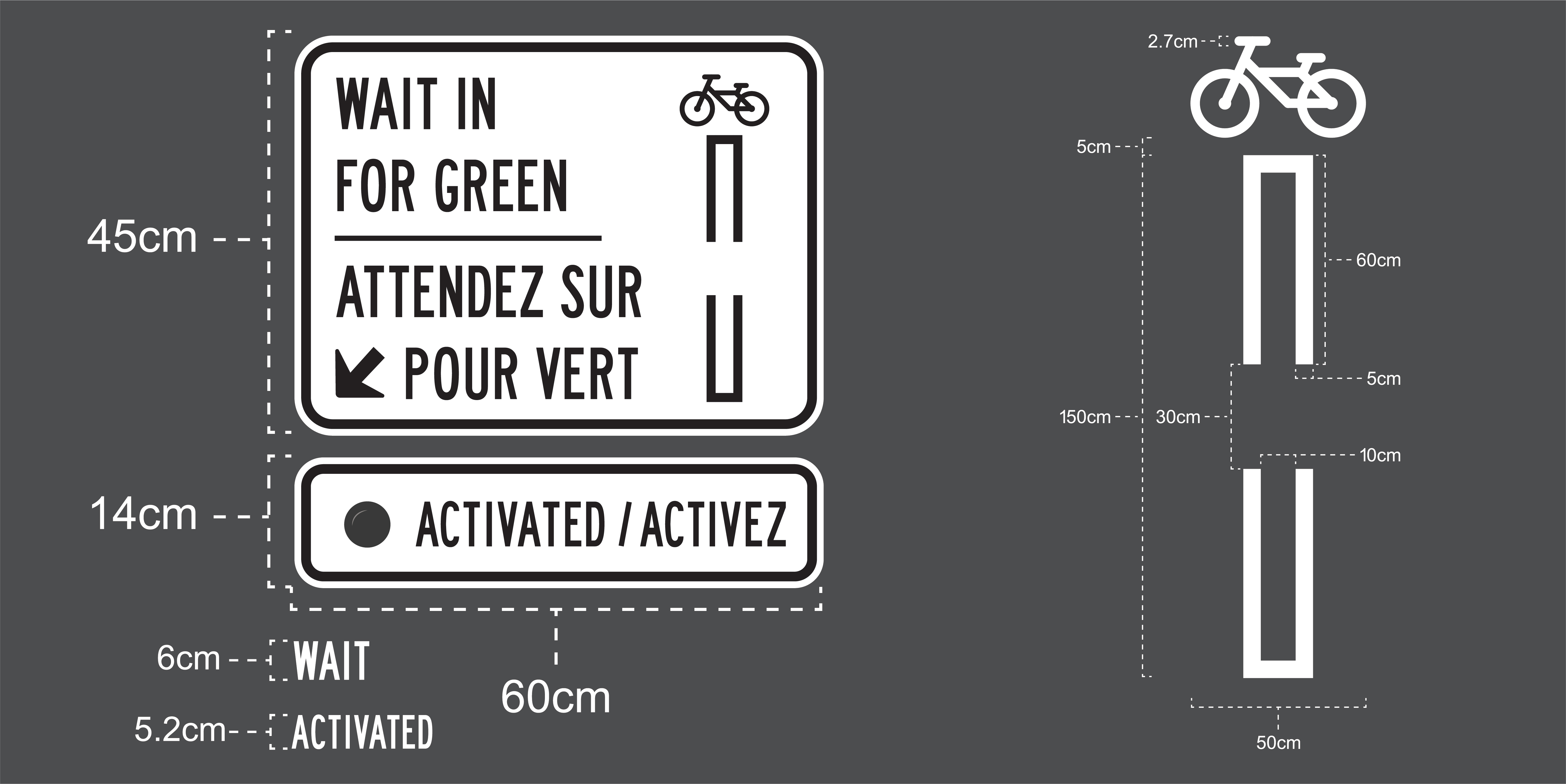
To ensure the pavement marking would be understood by all cyclists, we made an accompanying road sign for each option.
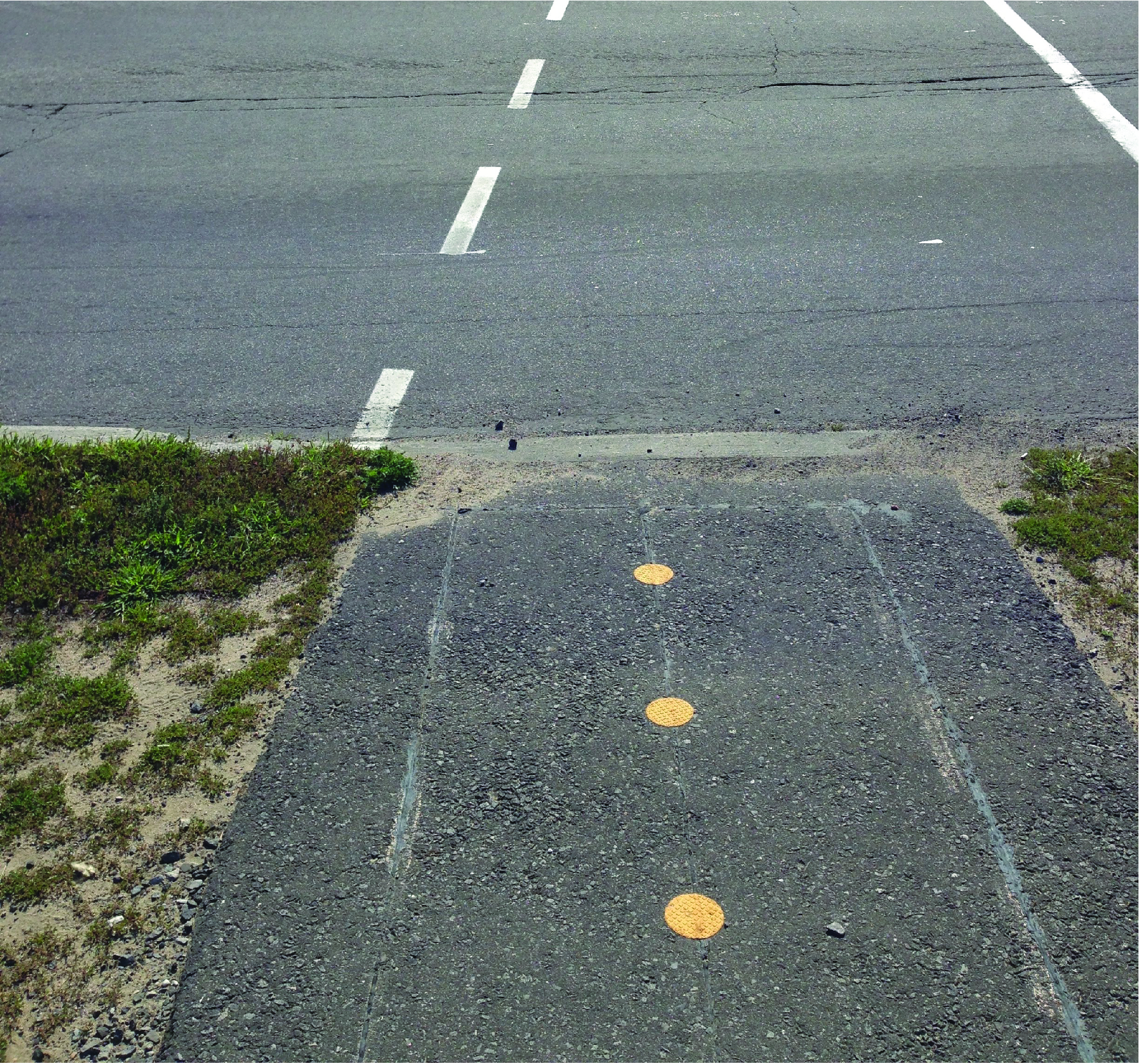
For the first concept, we made a symbol of a bicycle between the brackets of the pavement marking to show cyclists where to place their tires. On this concept, we also addressed the issue that cyclists were not sure if they were activating the induction loop. To solve this, we added a light that would be lit if a cyclist was detected on the loop. The client really liked this idea as they liked the idea of showing feedback to the cyclists. The activation light on this sign would also improve the safety of the induction loop system as it would reduce the amount of revert reds.
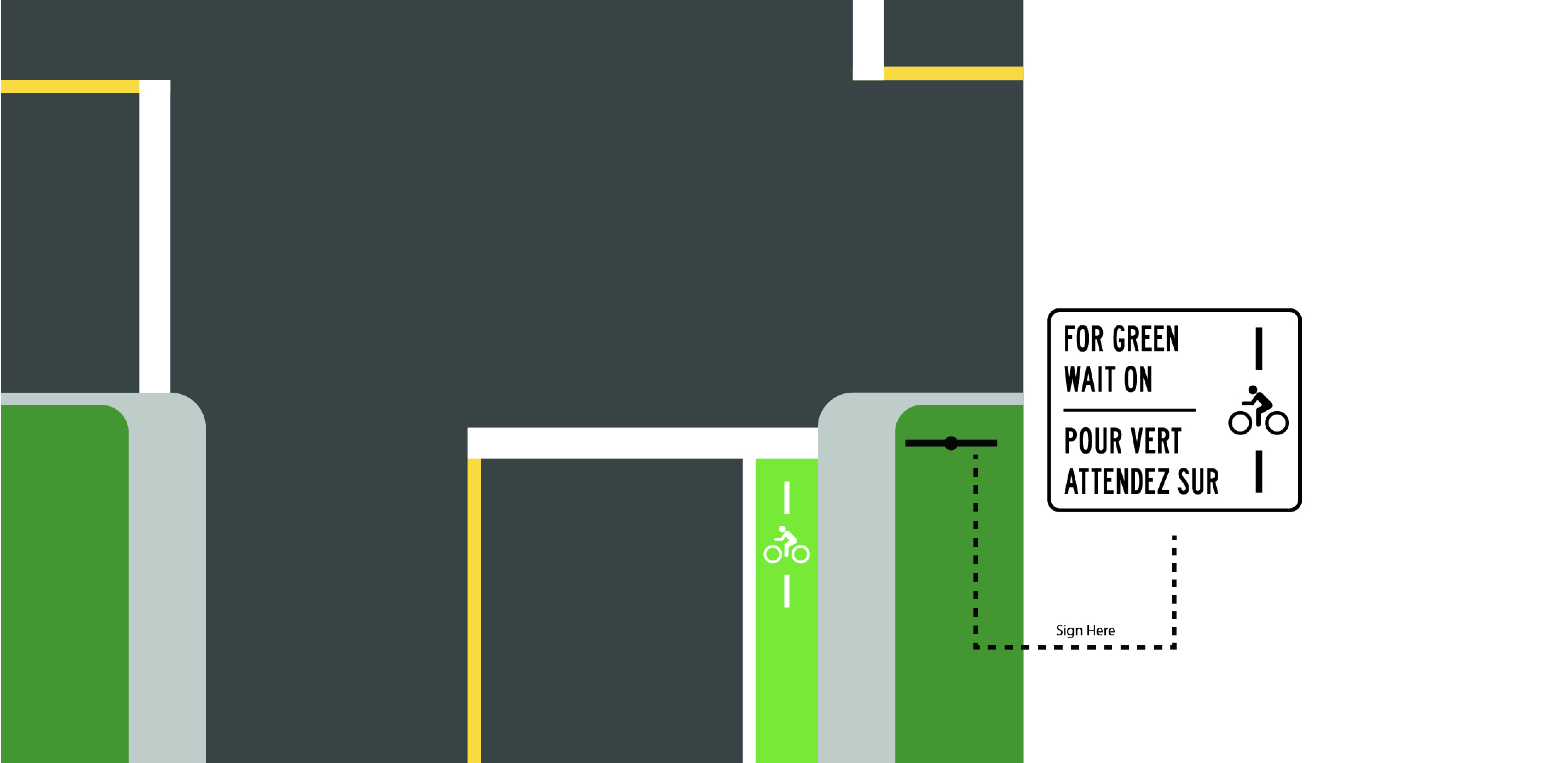
The second concept is a version of the R10-22 sign. It included both written instructions on the use of the symbol as well as the symbol itself. The client expressed that they liked the idea of having the pavement marking present on the sign since it would add association between the sign and the pavement marking.
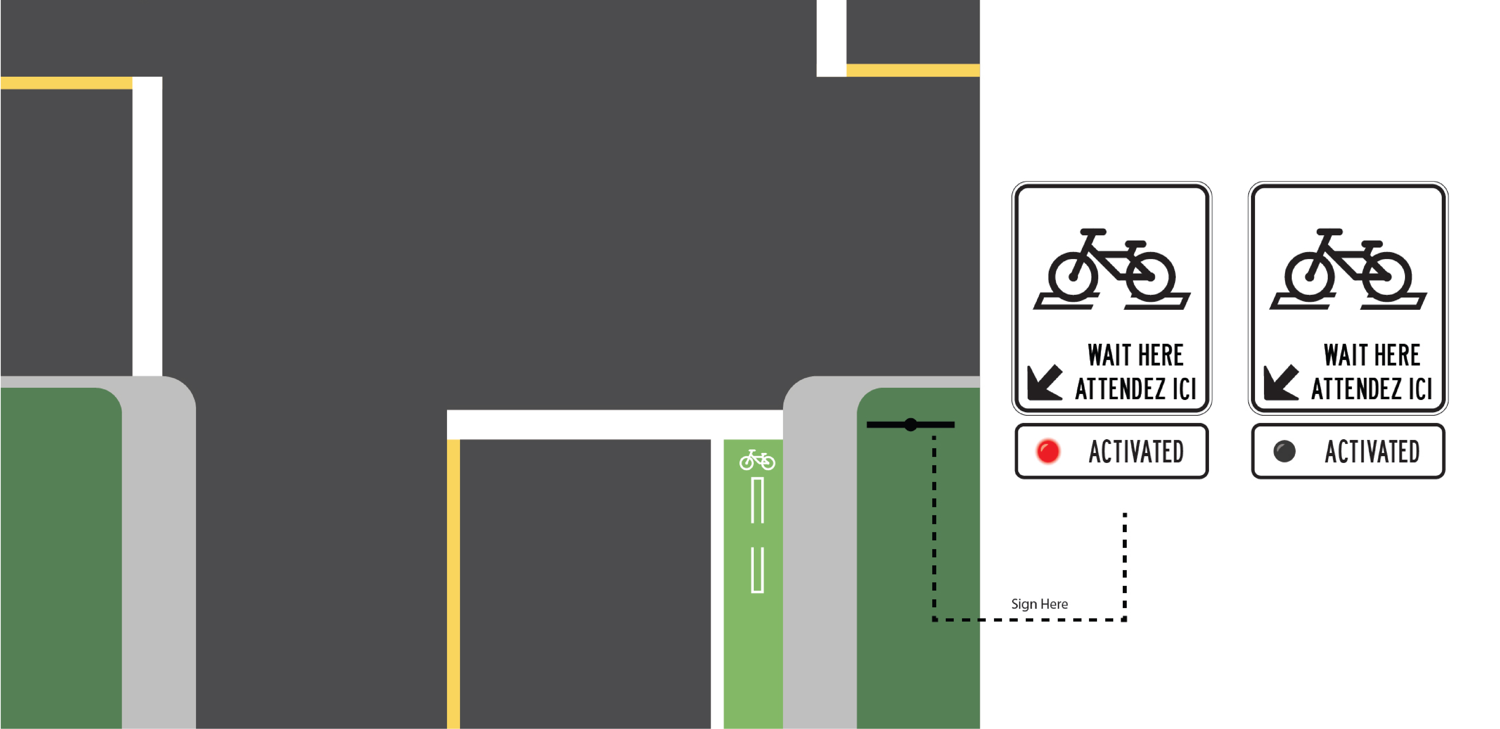
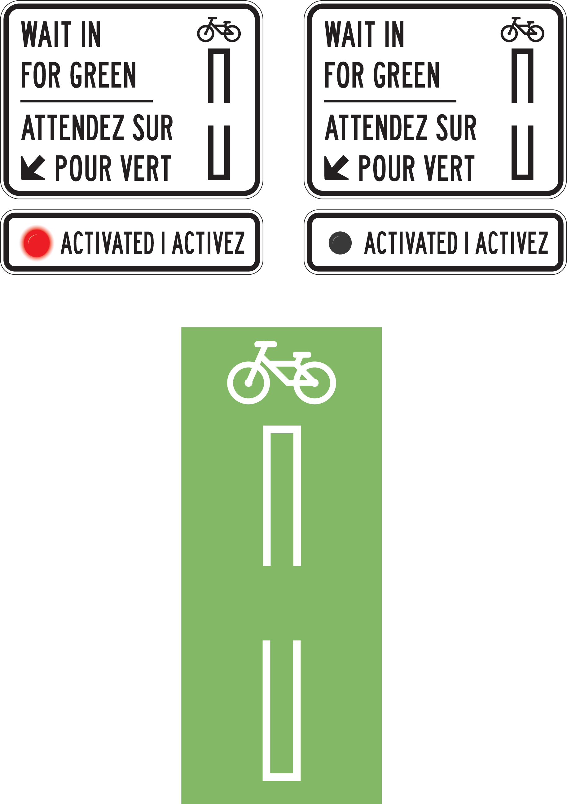
After meeting with the clients and discussing both concepts, we reviewed what was mentioned about each one. For the pavement markings, concept 1 was overall perfered by both the clients and the design team. We liked that it clearly showed where to place the bicycles tires. They did inform us that we needed to change the weight of some lines as it would be hard for their street team to paint our original line weights.
For the road signage, the clients really wanted to include the activation light on the road signage that concept 1 had, but didn't like that the pavement marking was not shown on the signage. This made us think of changing the pavement marking on concept 2's signage and add the activation light underneath.
To view the full case study of this project, click the button bellow.